A single beautiful product shot is not a campaign. A campaign is five or six frames that still feel like the same object under different light, different surfaces, and different supporting stories. I ran Gemini Nano Banana 2.1 through a realistic multi-scene product brief to see how far the identity would hold before the bottle, the label hierarchy, or the material response quietly became a different product. The results were instructive, uneven, and entirely typical of the commercial distance that still exists between generation quality and visual-system reliability.
Designing the Consistency Test
The Brief That Creates Real Friction
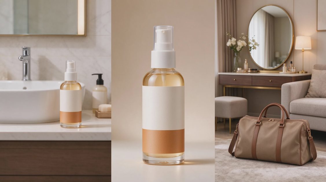
The brief was written the way a small brand or agency would write it: “We need a hero product and five supporting campaign frames for a limited-edition botanical body oil. The bottle must remain identical in shape, label layout, and material finish across all scenes. Scenes: bathroom counter morning light, outdoor linen surface, spa shelf with soft shadow, travel flat-lay, and evening vanity with warm practical light. Keep the product the hero. Supporting props may change. Do not alter the bottle geometry or label hierarchy.”
Identity Markers That Must Survive
Before any generation, I listed the non-negotiable markers: distinctive shoulder curve of the bottle, exact placement and scale of the primary label, matte-glass material response, dropper-cap silhouette, and the small secondary text block on the lower label. Any frame that altered those markers failed the consistency test even if the new image looked more polished than the original.
Evaluation Criteria
Each frame received three scores: identity fidelity (does it still look like the same physical product), scene appropriateness (does the environment support the brief), and revision resilience (can a single-variable change be applied without collapsing the identity). The campaign as a whole was judged on whether a client could approve the set without requesting a full reshoot of the product itself.
What the First Generation Sequence Revealed
Early Frames Held Together
The bathroom-counter and outdoor-linen frames preserved the shoulder curve, label hierarchy, and matte response with only minor lighting variation. Supporting props stayed secondary. At this stage the set felt coherent enough that a social-media manager could have scheduled the first two posts without immediate concern.
Drift Appeared at Scene Three
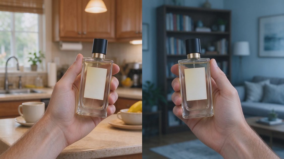
The spa-shelf frame introduced a softer, more diffused light that quietly rounded the shoulder curve and reduced the contrast on the secondary label text. The product was still recognizable, but a side-by-side comparison showed the geometry had softened. The travel flat-lay then altered the dropper-cap proportions slightly while rearranging the label’s internal spacing. None of these changes made the individual images less attractive. Together they began to read as a family of similar bottles rather than one continuous product.
The Warm Vanity Frame Broke the System
The final evening frame pushed the material response toward a higher gloss and shifted the primary label’s vertical placement. At that point the set no longer passed a strict identity check. A client reviewing the full campaign would have asked which bottle was the “real” one. That question is the precise failure mode the Consistency Room exists to catch.
Controlled Revisions and Their Limits
Single-Variable Edit Attempts
I returned to the strongest base frame and requested a controlled change: keep the product identical, alter only the background season from summer linen to autumn wool. The model preserved overall composition better than a full regenerate, yet the label hierarchy still drifted by a small but noticeable amount. A second single-variable request—change only the practical light temperature—produced a cleaner result, suggesting that lighting shifts are currently more stable than environmental prop shifts.
Multi-Variable Pressure
When the brief expanded to “make it feel more premium while keeping the same product,” the model interpreted “premium” as higher gloss, tighter crop, and a rearranged label. The identity markers that had been protected under narrow instructions became negotiable under broader aesthetic language. This is a recurring pattern: the more the instruction set leaves room for interpretation, the more the model fills that room with new details that break continuity.
Practical Workarounds Observed
The most reliable path in this test was to lock the successful base image, generate supporting scenes with extremely explicit protection language, and then move any frame that still drifted into a design tool for final geometry and label correction. The generation stage supplied strong lighting and environmental ideas. The design stage restored the product identity the campaign required.
Campaign Verdict and Production Implications
Overall Consistency Score
Across the five planned scenes, two frames passed a strict identity check, two required minor human correction, and one required substantial correction or replacement. That distribution is usable for a low-stakes social campaign with careful art direction. It is not yet reliable enough for a high-visibility packaging or retail campaign without additional human oversight on every frame.
Where the Tool Saves Time
The model accelerated the exploration of lighting and environmental mood. Generating five different supporting contexts in a single session is still faster than scheduling a multi-setup photoshoot. The time saved, however, must be reinvested in identity QA and selective correction. Ignoring that step simply moves the cost downstream to the client-review stage.
The Continuity Checklist Going Forward
For any product-consistency test the following markers should be locked before generation begins: primary silhouette, label hierarchy and scale, material response, distinctive hardware or closure shapes, and color relationships that define the brand. After generation, each frame should be compared side-by-side against the hero, not evaluated in isolation. Any frame that alters a locked marker should be flagged for controlled edit or design-tool correction before it enters a client deck.
Gemini Nano Banana 2.1 can produce campaign-adjacent product imagery. It cannot yet guarantee that the product will remain the same product across the full set without human visual-systems enforcement. Pretty frames are easy to generate. A coherent campaign still requires the same continuity discipline a traditional art director would apply to a multi-setup shoot.
Scene | Identity Fidelity | Primary Drift Observed | Production Verdict |
|---|---|---|---|
Bathroom counter | High | None significant | Usable as-is |
Outdoor linen | High | Minor lighting variation only | Usable as-is |
Spa shelf | Medium | Softened shoulder curve, reduced label contrast | Usable with minor correction |
Travel flat-lay | Medium | Dropper-cap proportion shift, label spacing change | Usable with correction |
Evening vanity | Low | Material gloss increase, label placement shift | Not ready without redesign |
For AI tool features, rules and availability, refer to their official sites.


Leave your thoughts here, too.